


The objects that tell stories, the colours that call to the senses, the materials that evoke certain moods – all these play a vital part in the design of a home by Arent & Pyke. Known for their focus on the psychology of space, the design duo maintains that a well-designed home can enrich your life. Their masterful approach to colour and materials results in optimistic, meaningful interiors high on charm and comfort.
With expertise in the softer nuanced tones of the tertiary palette, colours such as coral, nougat and olive, Juliette Arent and Sarah-Jane Pyke use colour to lift the spirits and arresting material pairings to evoke a nostalgic allure. Whether it’s the drama of three different types of marble or a checkerboard terrazzo floor of variegated greens, the Arent & Pyke signature style balances colour and materiality.
This, their first book, addresses their design ethos expressed through joy, colour, character, spirit and alchemy, and showcases their best work. Each of the projects featured include paint names, fabric brands, key learnings and insights into how these spaces were created. Generously illustrated and artfully designed, Arent & Pyke: Interiors Beyond the Primary Palette exemplifies how a thoughtfully designed space has the power to generate a sense of grounding, comfort and freedom to create a full, joyous living experience.
Read an extract from Arent & Pyke: Interiors Beyond the Primary Palette below!

Pp. 26 – True Romance
RESTORING THE HEART IN A 1920S APARTMENT
7 colours
220 m2
3 bedrooms
2 bathrooms
2 adults
In many ways, this is a love story. It certainly was for us. When we first saw this pretty 1928
apartment in Sydney’s eastern suburbs with its French-style arches and vaulted ceilings, we
were instantly smitten. For the owners, Kim and Karl, the flame was set on a slower burn, and our challenge was finding ways to fan it. The process ended up being an enlightening journey for all of us.
Far from being homebodies, this globe-trotting couple hadn’t yet set foot in the apartment they had bought. They couldn’t picture it as much more than a place to rest their heads between travels, and it was clear that their lifestyle wouldn’t be centred around cooking and entertaining. Our usual process is to help people work out how to live in the home they love, but this time we were helping them love the home they were going to live in.
Our clients both liked the interiors style of Parisian apartments and wanted this place to exude the understated luxury of a favourite hotel room. That feeling of quietude and repose, of stepping into your own little world – and, of course, those indulgent elements, such as the plush carpet, the enveloping sofa and the high bed you almost need to climb into.
Luxury can mean many things, but for us it is found in a generosity of space, a sense of serenity and a richness of colour and materials that enhance your living experience.
This apartment on the top floor of a Spanish mission-style building already boasted wonderful proportions and decorative elements. Our approach focused on reconfiguring areas to improve the flow and celebrating the romance and nostalgia of the property’s heritage by bringing back the elegance of its spaces.
A significant step was turning one whole side of the U-shaped apartment into a master suite – an expansive carpeted zone that is all about restfulness. Repurposing a spare bedroom as a dressing room to remove a cumbersome wardrobe from the master bedroom was a strong contributing factor to the generous feeling here. It freed up the wall of the master bedroom,
restoring the room’s proportion and balance, and allowed the windows to reclaim their symmetry and the bed to be centred for a more pleasing aesthetic.
The size of the room meant we could embrace a little drama in the colour scheme. Marine navy walls augment the serene mood, and the burgundy and marigold linens of the custom bedhead offer a rich contrast and highlight its softly sculptural shape. The owners’ vintage sideboard and bedside tables brought the warmth and solidity of timber, which we balanced with the rattan arcs of a mid-century armchair. The final component was a vintage leather screen, a decorative addition made possible by the newly empty wall. With an ornate vaulted ceiling, a view of the harbour and a heady blend of colours and textures, this space represents the ultimate in luxury.
On the other side of the apartment, we opened up the wall between the kitchen and television room by creating a huge archway with a sliding door. This offers a better connection between the spaces and allows the kitchen to benefit from the other room’s harbour views. The kitchen’s vaulted ceiling is uncluttered by cabinetry or recess lights. A discreet hanging strip light above the sink and a decorative pendant above the island are enough now that natural light also floods in. With cabinetry in a green so deep it is almost black, subtle brass accents and white glazed tiles, the kitchen is softly refined and welcoming.
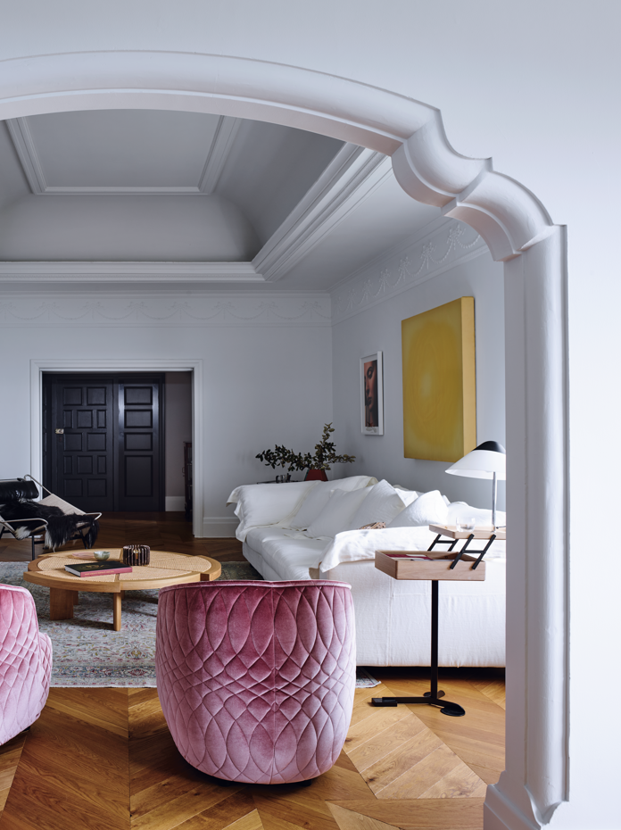
Of all the spaces, the most luxurious in scale and nostalgic in ambience is the living area at the centre of the apartment. It is a gloriously bright room and its grand volume draws you in the moment you enter the apartment, an effect heightened by the original decorative arch at the end with another harbour vista. While solid French oak floorboards are laid straight throughout the apartment, their chevron pattern here is a response to the beautiful ceiling and a celebration of this special room.
The classic, formal nature of this space is balanced with a blend of contemporary, traditional and iconic pieces. We reproportioned a tiny fireplace to better align it with its tall mantel, adding a pink-toned marble hearth and flanking it with a pair of ebonised timber cabinets. The austerity of the pieces is tempered by the asymmetry of their height and the way they are dressed. Against the contrast of black and white, two velvet tub chairs bring a little romance with their delicate rose colour and stitching detail, and the lines of a mid-century table and chair further relax the setting.
The relationship between client and designer is a delightfully meandering one, and it was a joy to witness this couple’s interest deepening during the process. We saw them come to enjoy the mix of elements – the way a vintage rug can bring an energy that is far from old-fashioned, and mismatched dining chairs can sit alongside a treasured family table. We shared in their growing appreciation of art, as they added their own discoveries to our suggestions. Their trust in us and their bravery in embracing this new home saw them sinking into their sumptuous new sofa, retreating to their bedroom sanctuary and even cooking in their elegant kitchen. This experience, of falling in love with something you didn’t know you needed, is also one of discovering that your heart can be where your home is.
TRUE ROMANCE
Interior designers: Sarah-Jane Pyke, Juliette Arent, Genevieve Hromas, Shannon Shlom
Builder: Daran Building
Photographer: Anson Smart
Editorial stylist: Claire Delmar
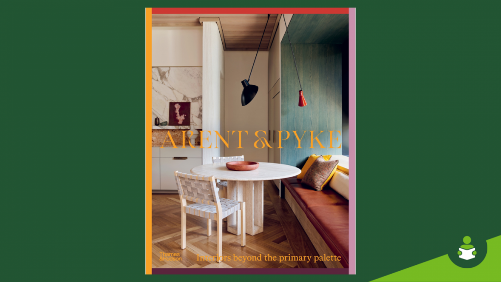
— Arent & Pyke by Juliet Arent & Sarah-Jane Pyke, published by Thames & Hudson Australia, AU$80.00, available 25 October 2022.

Arent & Pyke
Interiors Beyond the Primary Palette
The objects that tell stories, the colours that call to the senses, the materials that evoke certain moods - all these play a vital part in the design of a home by Arent & Pyke. Known for their focus on the psychology of space, the design duo maintains that a well-designed home can enrich your life. Their masterful approach to colour and materials results in optimistic, meaningful interiors high on charm and comfort.
With expertise in the softer nuanced tones of the tertiary palette, colours such as coral, nougat and olive, Juliette Arent and Sarah-Jane Pyke use colour to lift the spirits and arresting material pairings to evoke a nostalgic allure. Whether it's the drama of three different types of marble or a checkerboard terrazzo floor of variegated greens, the Arent & Pyke signature style balances colour and materiality.
This, their first book, addresses their design ethos expressed through joy, colour, character, spirit and alchemy, and showcases their best work. Each of the projects featured include paint names, fabric brands, key learnings and insights into how these spaces were created. Generously illustrated and artfully designed, Arent & Pyke: Interiors Beyond the Primary Palette exemplifies how a thoughtfully designed space has the power to generate a sense of grounding, comfort and freedom to create a full, joyous living experience.
 Booktopia’s Best Non-Fiction Books of 2022
Comments
No comments